The future of the Electronic Medical Record
Test task for UI/UX designer at Nortal
Design user interfaces for an Electronic Medical Records system: login and dashboard views. UI must include certain elements brought out in the task description.
Terminology (from healthit.gov)
Electronic Medical Records (EMR). Digital versions of paper charts at medical institutions. EMRs contain information collected by a single medical institution. Users are medical personnel of the institute, e.g. general practitioners (GPs aka family doctors), doctors, nurses.
Electronic Health Records (EHR). Include information from different institutions. For sharing information between multiple medical institutions incl laboratories. Users are medical personnel from multiple institutions, e.g. GPs, doctors, nurses, lab analysts.
Personal Health Records (PHR). Contain information from multiple medical institutions that a single patient has come in contact with. The user is the individual patient (a member of the general public) about whom the information is.
The user interface to be designed in this task is categorised as EMR. Therefore, we could establish that it will be used by medical personnel at a single institution, e.g. a GPs office. However, in the task details, it also says that one of the dashboard interface components is Kanta. A quick search reveals that Kanta is a Finnish Health Information System Service, akin to Estonian e-Health Records (aka e-health information system aka Tervise Infosüsteem aka Digilugu – “heal lapsel mitu nime“). These are actually Electronic Health Records since they provide a centralised system for multiple healthcare services providers.
But enough nitpicking. Since the task was to design an eHealth system for the *future*, then let’s just agree that, overall, we are going to design an EHR system. In my opinion, not having to manually deal with getting my patient records to a new doctor sounds way more convenient anyway.
That being said, let’s also agree that we are designing for the user being the medical professional (e.g. a doctor or GP), not the patient. Therefore, it is *like* an EMR system, but not quite. The difference is subtle, but important. If it was a pure EMR system we would not need to take into account that the user can also access medical information from sources other than their own clinic. But since they *can* access information from other healthcare providers, it means much more data the presentation of which our design needs to support. To sum up, the back-end and information structure look like they would for EHR, but the front-end and the UI are essentially designed as an EMR, keeping in mind that the data source is not only a single clinic, but multiple institutions. I hope you see what I mean.
Doctors say
As it turns out, I actually did an interview with a GP about 1.5 years ago. The goal then was slightly different – to figure out problems in healthcare – but some insights are relevant still.
For example, entering the information to an EHR takes a lot of time. Typically, 20 minutes are allocated per patient. If the visit takes less time, the GP is able to enter the information about the visit to the EHR system before the next patient. Often, however, there is not ime for entering the information between patients, so the GP spends 2-3 hours at the end of her workday simply to enter the details about each visit of that day. This indicates a need for faster and more convenient data entry, perhaps through automation.
Second, patients experience what GPs call “the white gown effect”. This means that the patients get a bit nervous at the doctor. Therefore, any measurements taken at the doctor’s should be taken with a pinch of salt as they can be slightly off. It would be nice if certain things could be measured before coming to the doctor or continuously, e.g. with wearables.
For GPs working alone, it is difficult to double-check their diagnosis. To do so, they have to write or call another GP at a clinic located further away. GPs could benefit from an immediate and direct communication channel with other doctors.
The EHR systems streamline GPs’ work. They help with statistics, documentation, and communicating with the Estonian Health Insurance Fund. It also helps specialists to decide which patients to see when. I.e. the GP sends a letter containing the patient’s medical condition and symptoms to the specialist who then decides how soon the appointment is needed. Such an approach ensures that people with serious problems get to specialists sooner than those who can wait for a while.
However, the EHR systems do not automatically notify the GP of her patients’ visits to the emergency rooms (ER), nor calls for a medical emergency response team. Unless the patient tells it to their GP themselves, the GP won’t find out because finding that information is too complicated and time-consuming. In the old days, GPs would receive a pink paper slip from the ER with information about why their patient turned to the ER.
An emergency response team medic who sometimes interns at a GP’s office for his studies said that the specific office he interns at does not use a digital system for scheduling appointments. They simply write that information in a paper-based notebook because the number of patients is low.
I really enjoy doing user research, so I contacted a friend’s mother who is a general practitioner. She told me a bit about her work and the software they use at her (small countryside) clinic. Here’s what I found out.
-
When opening the system in the morning, the first thing the interviewee looks for is analyses results from previous days, e.g. bloodwork.
-
Again, the lack of information sharing between GPs and ER was mentioned. Also, results from meetings with other doctors who the GP has directed her patient to are not pushed and the interviewee does not always remember to actively search for that information herself. This means that sometimes, important information or time-critical information can get lost, even though it is technically there in the system.
-
Current programs suck. The interviewee uses Datatree (which I can’t even find on Google). If she wants to see statistics about her patients, she has to enter the exact same information in multiple places. The program also “argues” with the user. For example, if the GP has entered blood pressure information at one place, but not copied it to another slot, the program alerts her of missing information when setting a diagnosis – even though she entered the information to one place already.
-
In Estonia, the Estonian Health Insurance Fund covers the costs of tests and analyses to some extent. Once that limit has been reached, the GPs need to calculate their expenses using a different quota. However, the system does not notify the user of the exceeded limit, nor does it help with handing in the information properly after the quota has been maxed out.
-
The interviewee remembers the medical history of a lot of her patients by heart because her clinic is small. Problems arise with new people or those who haven’t visited for a while. In that case, an overview of previous appointments is useful.
-
The program that the interviewee works with checks compatibility between medicine (e.g. short-term antibiotics, long-term drugs) automatically when a new prescription is entered. As a matter of fact, it doesn’t even let the GP send the prescription to the pharmacies before she has looked through the conflicts and decided what to do with it, e.g. stop one medicine temporarily or replace the prescription.
-
DIgilugu enables patients to hide some information from their doctors. The doctor gets a notification that something has been hidden, but does not know what and why. Not all patients elaborate on the reason. This can make giving diagnosis more complicated.
-
Entering the information is still very bothersome because of duplication requirement – entering the same information in multiple places. It would be much easier if there was a normalised form with an option for comments (or perhaps using Natural Language Processing?). The programs also tend to crash, so some GPs first write everything in Word and then copy-paste it to EMR.
-
The interviewee’s EHR software does not recognise work injury cases automatically. Instead, she has to manually send a report to the Labour Inspectorate, even after she has entered the code for work injury to the program.
-
During the novel coronavirus pandemic, Estonia set up an online system where people could ask for the proof of incapacity for work (for not working while ill) without going to the doctor’s. People filled in a form, the information was forwarded to their GP who then had to call the person within five working days. That was very time-consuming for the interviewee (spent two hours calling 12 people) and some people did not even answer their phone, nor did those patients call back!
-
Doctors are encouraged to treat data entry from the legal point of view due to an increased number of complaints and court cases started by dissatisfied patients. This means they have to ensure they enter the data under their own account and include even the tiniest details. Such documentation will act as an accurate trace of what happened and is also helpful for lawyers.
-
From the patients’ perspective, it is also important to remember that currently, a lot of people who turn to GPs are old and not tech-savvy. Therefore, they will prefer calling to any digital solutions which is time-consuming for doctors and nurses. Perhaps that will change in the future.
Future trends
Let us quickly have a look at some trends in healthcare that might be important to take into account when designing our system and its interface. Since we are designing for a doctor, I’m focusing on changes in healthcare that influence doctors.
-
Telehealth. Man, COVID-19 really changed everything, didn’t it? Telehealth means doing healthcare services remotely, i.e. diagnosing and treating patients via a video or phone call. There is no physical contact between the doctor and the patient. Traditionally, the doctor touches, feels, measures, scrapes, pokes, and tickles the patient to really get a good overview of the problem. This is not possible in a video call yet (although I do look forward to advances in teleinteraction and being able to touch something in a remote environment). With simpler issues, however, using video consultations is possible. For our design, this means that we need to support setting up a (scheduled) video link between the doctor and the patient.
If we take a step further, I think it would be super cool to take advantage of augmented reality, too. Do you know those testing kits that you can order home and send back to a lab, e.g. for STDs or gene studies? Those are easy to use when we are talking about peeing in a cup or poking around your throat with a cotton swab, but what about drawing blood? Perhaps AR could be used to pinpoint the location to poke with the needle? Or maybe we could have an armband that automatically finds the vein and draws the blood? A surgical robot sent to your home? So many possibilities! But I am getting lost in thought here. Let’s get back on track.
-
Trackers and wearables. What did you eat for breakfast? How well did you sleep last night? How many steps did you do last Friday? When was your last menstruation and how long did it last? What’s your insulin level? Are you mostly happy or sad? What was your highest pulse last month? There are so many physiological and behavioural features we can track by using wearables and apps. It’s a pity we are not using that information already. Just imagine how much more information a doctor would have and how that could be used for a more accurate diagnosis! The implication for our design: support importing data from the patient’s apps and devices. Preferably done by the patient before the visit, but should also be possible to do at the clinic.
Yes, those same questions could be asked by the doctor if necessary, but firstly, humans suck at remembering such minor things and secondly, importing that data is much faster. Human-human interaction, bleh! (Kidding, of course. I hate the idea of losing all HH interaction.)
-
Artificial intelligence (AI) for a better diagnosis. As seen above, trackers produce a huge amount of data. It is impossible for a single clinician to go through and make sense of it all. Here, algorythms could come to the rescue. Imagine a system that automatically imports data from the patient’s wearables, analyses it, and presents the doctor with a single diagnosis and treatment plan. We wouldn’t even need to go to the doctor! Until we reach the point where AI is smart enough to replace all GPs, however, the systems could easily work alongside the doctors, helping them in their work. Therefore, the design could have an “automatic diagnosis” feature that eats up all the information provided by the patient and doctor and spits out potential diagnoses and treatments that the doctor can then choose from.
-
Chatbots as doctors’ assistants. You know how when you start looking for your symptoms on Google it always turns out to be cancer or lupus? What if there was a virtual assistant who listened to your complaints, filtered out the important information, and, if necessary, directed you to a doctor for more accurate analysis and treatment? Actually, similar things already exist, e.g. Babylon Health or WebMD Symptom Checker. These could be easily combined with an EHS to provide the doctor with preliminary information and make the visit quicker and more efficient. In that case, the doctor would already have some information about the patient’s issues before they even walk through the door. The virtual assistant would be like a filter for the doctor.
-
The connection between healthcare services. This sounds like a no-brainer for an Estonian who is used to their information being seamlessly shared between doctors and pharmacies and other medical institutions. This is not the case for every other country, though. As an avid user of such a system, I hope in the future such centralised EHSs are more widespread throughout the world. For example, GPs could immediately send information, e.g. heart images, to cardiologists for quick diagnosis. For us, this means that the design should include the possibility to send something to other doctors or perhaps a community of specialists.
As you can see, this is definitely my favourite part of the assignment. I could go on for much longer. But let’s not because I still need to get to the actual UI design, too. To sum up, I think some interesting future trends to design for are remote appointments, importing information from trackers, having AI assist in gathering information and proposing diagnoses and treatments, and creating quick communication links between GPs and medical specialists.
For more futuristic ideas, see how tech changes healthcare, what AI solutions are out there, or seven visions for the future.
Mobile vs desktop
A good principle is to design mobile-first, i.e. design the interface for a small and portable device before “stretching it out” for a desktop view. Is this necessary in a medical context, though? To answer that, we need to know *where* the medical personnel is going to use the EMR system. Let’s look at two examples.
-
At a GP’s office (clinic). Most of the time, patients go to the GP’s office that has a specific location. The GP works at their office, in a dedicated room. Therefore, the room can have a stationary computer where the GP enters information before, during, and after the patient’s visit.
-
Home visits. Some GPs also do home visits, i.e. the GP packs a bag and finds their way to the patient’s place where they diagnose and/or treat the patient. At the UK, GPs do home visits that make ‘clinical sense’, e.g. to bedbound patients, but prefer other patients coming to their clinic. For home visits, a portable device, e.g. a smartphone or a tablet, makes more sense than a computer because it is easy to carry and use.
It would make sense to support both of these scenarios, i.e. a mobile/tablet and a desktop app. On the other hand, EHRs contain a looooot of information, such as a list of all patients, general info about each patient, previous medical history, lab results, doctor’s reminders and notifications, prescription renewal requests, agenda and schedule… It’s quite a challenge to fit all that on a tiny mobile screen.
However, I still consider doctors working stationary and patients being the ones running around a stronger use case than the opposite. In the future, I also don’t really see it changing to a scenario where doctors are entering patient information while grocery shopping or gardening. Perhaps there will be no need for physical contact, i.e. both the doctor and patient are at home, but I still think (and this should be checked) that doctors prefer having a dedicated time and place for their work, be it a clinic or a home office.
For now, I have decided to focus on the desktop view.
Inspiration
Since there is no point in reinventing the wheel completely, I decided to take a look at some existing EHR programs. Turns out that there are SO MANY e-health software solutions! And all of them look too complicated for me. There is just so much information that needs to be presented. Here, I really wish I could actually observe some doctors to figure out which information is necessary and which could be hidden away under navigation.
I also had a look at Dribbble to see what other UI designers have come up with. These look much nicer to me already. Cleaner and simpler. I made a collection of some that I enjoyed.
The actual UI
If you haven’t realised already, I am much better at analysing what needs to be done, how, and why. If I’m being completely honest with you, I haven’t even used Figma before. I don’t think I have even proceeded past wireframes and basic UI mock-ups. So bear with me while I dive into Figma and UI.
I found Figma rather interesting. My approach was to try to use a lot of pre-existing components made by other designers. However, I soon found that a lot of them are made in a way that makes customising them (changing size, ordering etc) quite a challenge for a newbie like me. Stuff just wasn’t moving the way I wanted it to! I’m sure I could figure out the constraints and overflows and interactions and all the other possibilities Figma offers if I put my attention to it. But this time, I was also trying my best to fit the actual UI design work in 6 hours. This means that the result is, and pardon my French, a clusterfuck. That being said, I think I did well for my first time ever.
Have a look at the resulting thingy-majingy HERE.
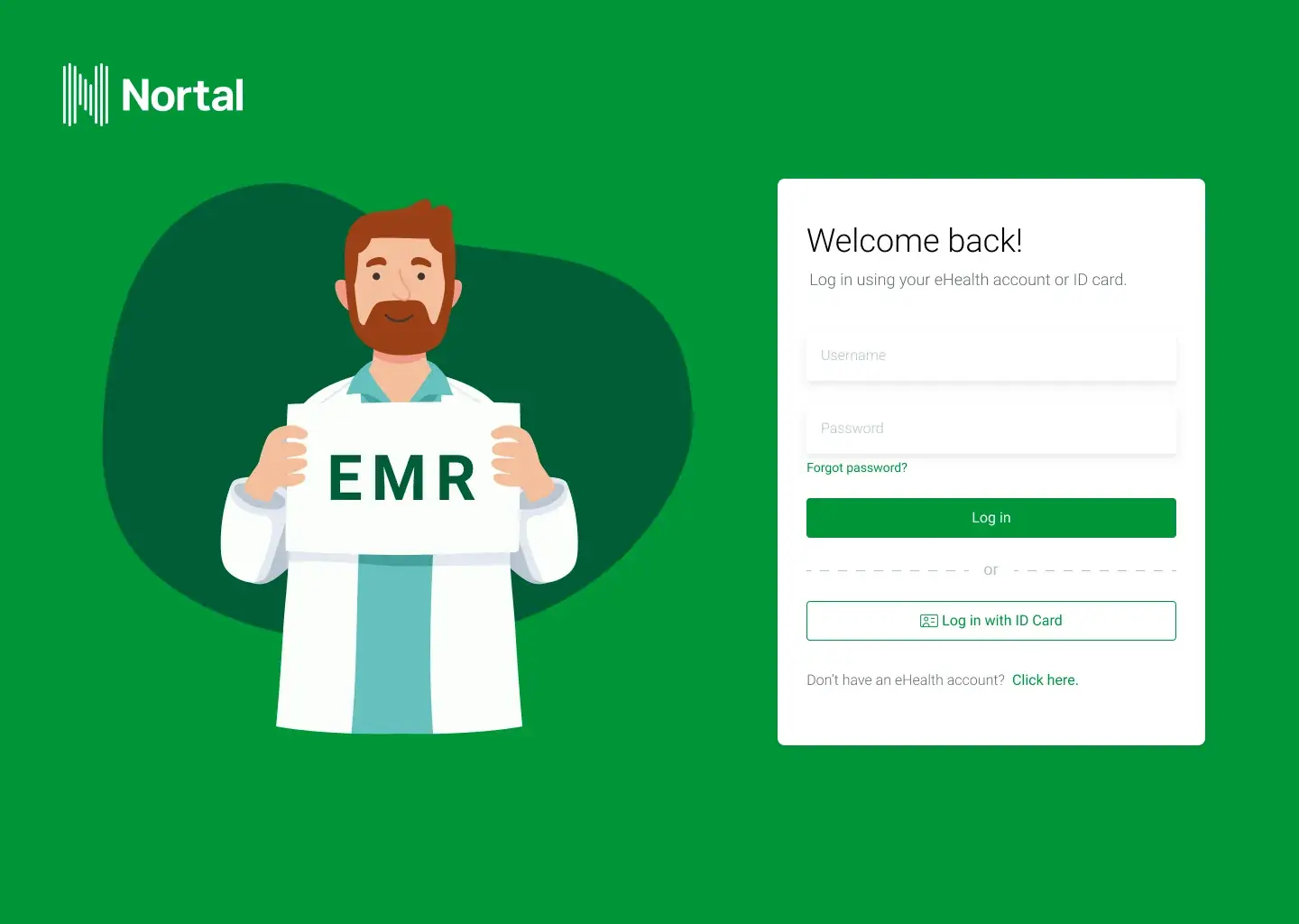
Here are some notes about the login view:
- No “remember me” functionality on login screen because we are dealing with sensitive data and don’t want others to access it. This will make it more inconvenient for the doctors, though, especially if combined with timeout+log out.
- I switched “eHealth account” and “ID card” from tabs to sections as I think it gives it a better overview – all options are visible at once.
- No idea where to put the “product name”. I would like it to be integrated with the graphics that I put on the left side.
- Personally, I kind of like how the login turned out. Plus, it would look nice on mobile, too! Just remove or reduce the graphics on the left side.
- I tried to use Nortal’s colours as much as possible because, firstly, this is a test task for Nortal so I am using their branding, and secondly, colour psychology claims that green is for stimulation, comfort, and nature while purple conveys reliability, wealth, and spirituality. According to Cameron Chapman, green can also represent a lack of experience and I find this amusing.
And my reasoning for the dashboard view:
- Ooh, boy, what a mess! There is just so much information that the UI needs to accommodate in the assignment description. I am not sure I agree with all of it. I would prefer a much cleaner UI with less information and popups or modals. I tried to include everything nevertheless, but let it be known that I did not enjoy this and my brain hurts when I look at the end result.
- The left menu bar has icons only when collapsed. This is to have more space for the dashboard. However, since not all icons on there are intuitive, the menu bar can also be “pulled out”. I imagine that at some point users would learn which icon stands for what and then they would not have to open the full menu anymore.
- The task said to incorporate a link to Kanta which is a Finnish EHR system. I’m not fully sure what they meant with that as I always thought that EHR info is integrated to the existing UI not something separate that one is directed to.
- The prescriptions panel automatically checks whether there are conflicts between a patient’s medicines. Such functionality already exists in some Estonian GP apps and is assessed as convenient (claim by the GP interviewee, see above). So I use colours (red, yellow, green) to indicate potential conflicts.
- Personally, I like Apple’s calendar. In there, you can simply use the mouse to “drag”-create an event – essentially, you highlight a time slot and that becomes an event. It would also be cool to have the natural language processing aspect from Apple. By that, I mean the functionality where you simply type event information into a text box (e.g. “appointment with Mary Smith on Wednesday from 13 to 13:30”), the calendar parses out the relevant info and creates an event based on that. That would mean more typing but less clicking. Not sure which one would work better.
- The calendar shows time intervals in 30 minutes as a GP told me most appointments don’t last longer than that.
- I also don’t think having “day-week-month” selectors in the calendar section on the dashboard is the best idea. The dashboard should show only the most relevant information (which is already a lot). I would just keep them under a separate calendar page. Then again, just an assumption here.
- The “Next patient” panel features some AI integration, e.g. proposed diagnosis. Still, the doctor can always double-check and adjust it.
For more comments, check out the Figma project.
Reflection
I really liked this assignment. Doing “proper” UI design was a challenge because I hadn’t really done it on this level before. I had to get friendly with Figma for the first time. I have done paper prototypes and wireframes before but not a UI with actual UI elements. Personally, I would have preferred presenting my ideas on paper or as a simple wireframe first. That still feels more natural to me. But that is probably because I haven’t tried it any other way.
I feel like it would have gone much faster if I actually knew how Figma works or if I had a proper library of premade elements. Now, I had to tame all the constraints and alignments and drop shadows. That would have been easy if I hadn’t had a goal and could have just played around with it from scratch. I will surely do that in the following days, after having submitted this task. I also tried to use collections of premade elements, but none of them were “just right”, so I had to figure out how to make them fit with my vision. It got quite messy and I am not proud of it, but I suppose it just needs some practice and theory (which is available online).
I think it is safe to say that I think more like a service designer. I really enjoy analysing and researching and interviewing people. This task did not ask for contacting any doctors, but I still reached out to a general practitioner I know. Firstly, because I always enjoy finding out more about the current situation and problems. Secondly, because I thought it might come in handy for the task. We actually agreed that I could observe her working with the EHR systems next time I am in Saaremaa! I am so looking forward to that!
I was also really torn about the assignment description. It’s not that I don’t trust Nortal’s UX team, but I would have really liked to be there when they established those requirements to understand where they came from and why. I still do not agree with all of the requirements (especially the abundance of information), but since I was not there at stakeholder meetings or user research sessions, I do not have enough basis to claim that it is not correct. However, I still hate the feeling of being given a seemingly random input without knowing the iceberg behind it.
Overall, it was a fun assignment to work on and I completely lost myself in it. Now, I will just have to see what Nortal thinks of it.